50% of the bandwidth of your brain is used to process your vision.
We are visual animals who not only constantly evaluate our surroundings through sight, but are capable of extracting information and logical conclusions out of abstract graphic representations. That’s why data visualization is such a powerful tool, which can communicate nearly anything more effectively than text.
That skill–the ability to interpret data and analyze and communicate ideas about that data through design–has never been more important. 2018 brought a wealth of remarkable visualization work to the fore, and much of it changed our perception of the world around us. Here are a few of the best.
The true size of world powers? Not as big as you think
Animating the Mercator projection to the true size of each country in relation to all the others.
Focusing on a single country helps to see effect best.#dataviz #maps #GIS #projectionmapping #mapping pic.twitter.com/clpCiluS1z
— Neil Kaye (@neilrkaye) October 12, 2018
You probably already know that countries like Russia, Canada, the U.S., and even regions like Europe are smaller than they appear in the Mercator projection. But this year, the cartographer Neil Kaye truly put that radically biased mapmaking in perspective–through this animation comparing how countries look on a Mercator map versus their actual geographic reality.
The terrifying state of our atmosphere
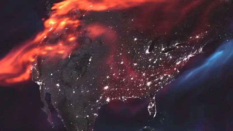
NASA’s Earth Observatory released a terrifying new edition of its Earth atmosphere map, complete with a new Mordor-style color palette. The comparison is apt: the viz shows the aerosols suspended in the atmosphere on a single day in August. The orange is black carbon smoke produced by fire and coal burning, purple is dust, and blue is ocean salt suspended in the air by storms. In short, it was a shockingly impactful glimpse of our planet in crisis.
The tangled web of corporate corruption
[Screenshot: courtesy Data Interview Questions]
78% of the top 50 companies in the S&P 500 are directly connected through one or more board members. From Disney to JP Morgan Chase, it’s all a tight network of friends that fuel corporate corruption and even economic crises, according to the Harvard Business Review. This visualization by Erik Rood shows these connections with shocking clarity.
The other environmental crisis
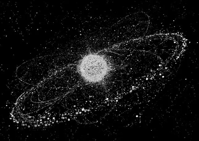
When the Dutch artists and designer Daan Roosegaard learned that there are about 18 million pounds of junk orbiting Earth–not working satellites, but actual junk, like detritus from old rockets, random spaceship pieces, and dead satellites–he decided to start a project called Space Waste Lab, which resulted in the visualization you can see above. It gives us a glimpse into an environmental crisis that isn’t even of this world.
America’s real estate insanity
[Screenshot: Felipe Chacon/Trulia]
As the economic bubble continues to expand, the gap between Americans continues apace. According to real estate platform Trulia, more than 3 million U.S. homes are currently worth $1 million or more, which doubles the count from 2012. This interactive map shows where all these houses are concentrated across the country. It may not surprise you to learn that California is at the center of this affordability crisis.
The beating heart of NYC
[Image: courtesy Justin Fung]
Viz designer and researcher Justin Fung used data from the 2010 Census, the MTA’s turnstile database, and a previous NYU study to estimate the population of each block in Manhattan and create this fascinating animation map about how it changes hour to hour during the entire week. It’s truly like a living organism.
How companies share your data
[Image: Rebecca Rinks]
Another topic that was widely discussed this year–privacy–was also more thoroughly descrived through data viz. This visualization by researcher Rebecca Ricks shows
how widely companies share your private information using data from PayPal in the European Union. It’s not only Facebook, although it’s certainly a major offender because of the sheer amount of info you give it. But as Ricks proved, it’s far from the only guilty party.
How Trump pockets your tax dollars
[Image: ProPublica]
Donald Trump promised to “drain the swamp” and stop corrupt “elites” from profiteering off the hard work of We The People. As this infographic by watchdog ProPublica shows, he’s doing exactly the opposite. Based on 27 investigative pieces, it illustrates how much federal tax money is going to Trump’s private business and campaign.
Google Earth, but 750 million years ago
[Screenshot: dinosaurpictures.org]
Then there were downright delightful visualizations like Ian Webster’s. Webster thinks that giving people the capability to track where their homes were located on our planet’s surface at any time in the past 750 million years is a great way to teach humans about geological history. I fully agree. Enjoy a little time travel here.
The map that put it all in perspective
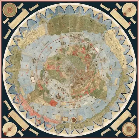
And finally, something relaxing. You’re looking at one of the most extraordinary maps ever created: a 10-by-10-foot digital image of a 60-sheet world map drawn by hand in 1587 by Italian cartographer Urbano Monte–the largest known early map of the world. It’s not a 2018 map, but a new interactive version was uploaded this year to the David Ramsey Historical Map Collection at Standford University after a painstaking digitalization process. It was a brief respite from a year of political, economic, and environmental shocks.
Recognize your brand’s excellence by applying to this year’s Brands That Matter Awards before the early-rate deadline, May 3.
