This morning, the President of the United States published a tweet about how he and Japanese Prime Minister Abe Shinzo are working together “to help balance out the one-sided Trade with Japan.”
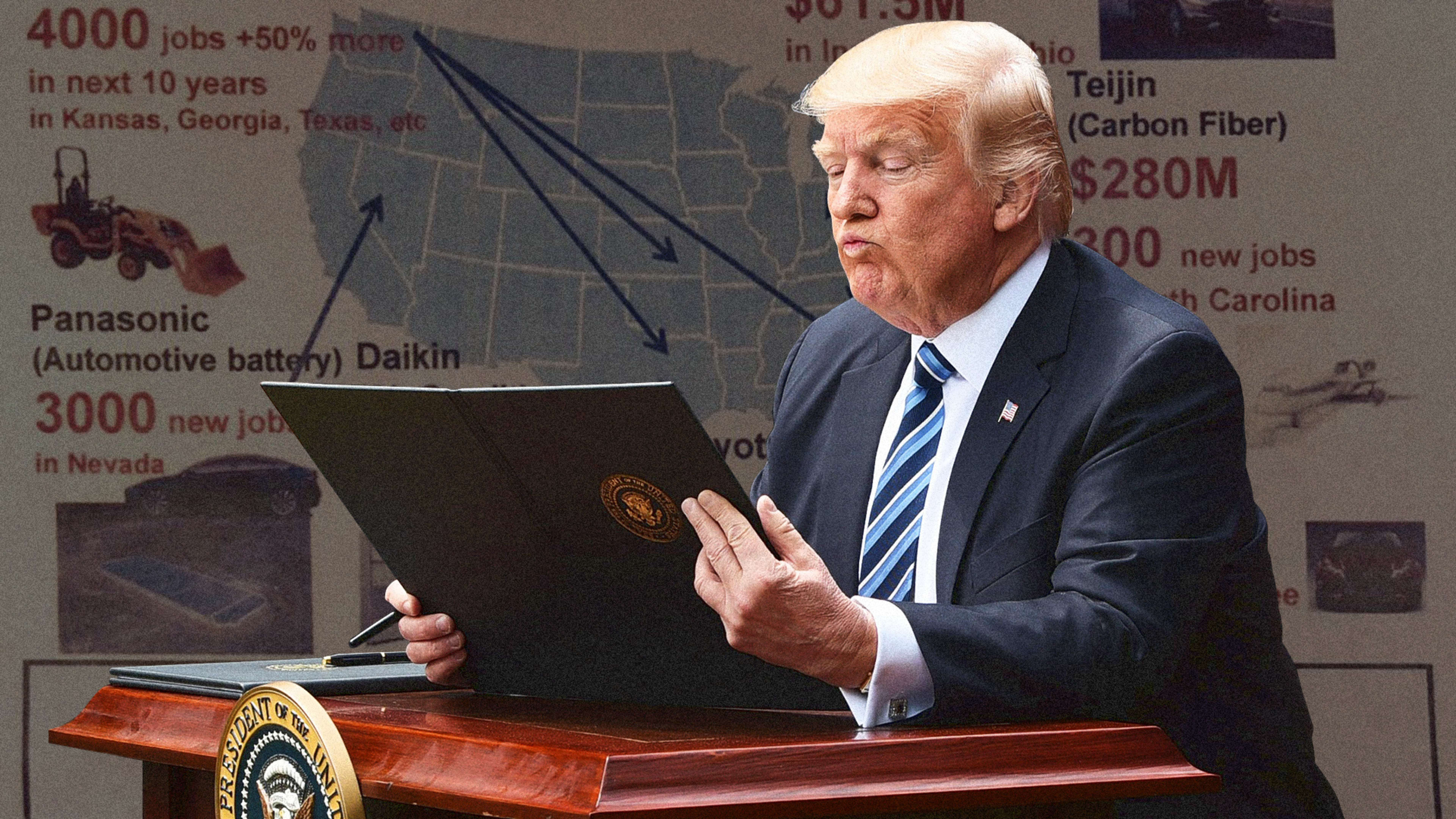
To illustrate, he included a map of the United States, with specific “recent major Japanese investment” updates called out for different states. Take a look:
Prime Minister @AbeShinzo of Japan has been working with me to help balance out the one-sided Trade with Japan. These are some of the investments they are making in our Country – just the beginning! pic.twitter.com/ib2yB3Akkt
— Donald J. Trump (@realDonaldTrump) October 18, 2018
It’s a mishmash of information, numbers, and graphics, with a cutout image of each type of product–tractors, SUVs, air-conditioners–accompanying the actual text, which is rendered in a grab bag of colors and sizes without hierarchy.
The origins of the slide aren’t clear, but it falls in line with what we already know about the types of briefings President Trump prefers. Last year, the New York Times described the way presidential briefings and policy documents have changed since Trump took office, writing that “while Mr. Obama liked policy option papers that were three to six single-spaced pages, council staff members are now being told to keep papers to a single page, with lots of graphics and maps.” We knew that Trump has a notoriously short attention span, but we didn’t know it was this bad.
Recognize your brand’s excellence by applying to this year’s Brands That Matter Awards before the early-rate deadline, May 3.
