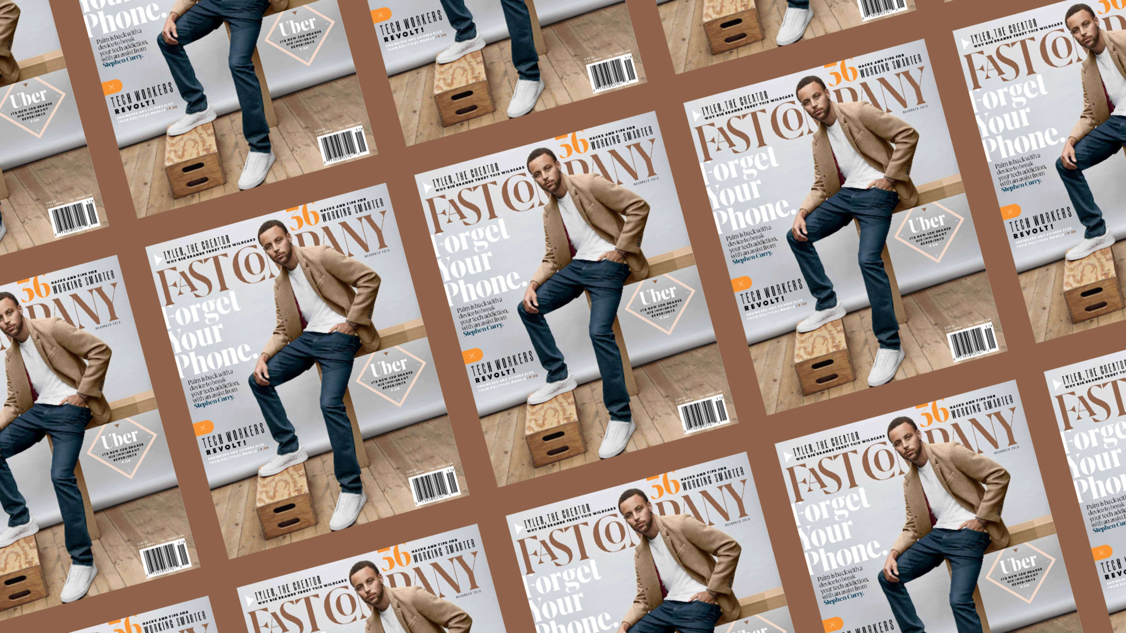
Just as Fast Company covers the most creative minds out there, it’s our mission to continually innovate our brand as well. With the release of our November print edition, I’m excited to announce that we’ll be launching a new design for Fast Company.
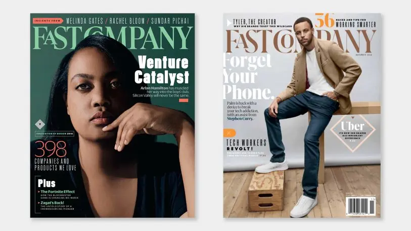
Why a redesign?
In the past five years since our last redesign, the intersection of business and design has changed dramatically. A half-decade ago, Fast Company focused on the tidal wave of technology from companies such as Google, Uber, and Twitter, which changed the flow of our everyday lives.
In 2018, culture has adjusted to the fact that technology is intertwined in our daily lives. As a result, the focus of our journalism has turned back to the people–to those driving larger change in the areas of diversity and inclusion, at companies both big and small. Given this new emphasis on the people in tech, I wanted the new visual design of Fast Company to better understand our end user, and create a stronger emotional bond with them.
[Animation: Rick Wake]
A grown-up logo
Research is the first part of any design job. (Side note: I call these “design jobs” because my favorite old-school teachers at Pratt Institute, including the mighty Bob Gill, cofounder of Pentagram, used that phrase.) As the Fast Company brand progresses into its 25th year, I wanted to signify this sea change in business, but also our history leading up to it.
When Alan Webber and Bill Taylor launched Fast Company in 1995, their goal was to marry Harvard Business Review‘s insights with Rolling Stone‘s energy. They tapped magazine logo legend Jim Parkinson–whose resume includes Esquire, the Wall Street Journal, and, yes, Rolling Stone–to design the brand. Jim crafted a classic serif logo for Fast Company, but gave it some personality through a quirky small cap “A” and “O.”
More than two decades later, those little letters have become a welcoming signature of the Fast Company brand, and I wanted to lean into that legacy. Working with Portuguese type designer Rui Abreu, we set out to create a new logo that felt more mature than the previous iteration, but maintained its playfulness. Think of it as wearing a blazer with a T-shirt, a staple of many creative directors (including myself). I wanted a wordmark that was still rock ‘n’ roll–heavy metal, even.
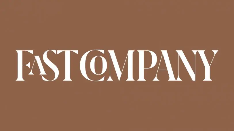
The wisdom of the Fast Company brand is achieved visually through the extreme vertical contrast of our new letterforms, a strong characteristic of neoclassical typefaces. The new logo is modernized through the sharp triangular terminals on the letters, a technological achievement not possible in the earlier days of old-style serif type, which is what the original Fast Company logo was modeled after.
The demands of a logo in 2018 are greater than ever. Our new logo needed to live across a variety of platforms, from desktop to mobile websites. Such a high-contrast logo posed a problem for scalability, because if you shrink it down to mobile size, the thin areas of the letters would disappear. To solve that problem, we created two smaller sizes, where the thin areas have been progressively thickened for smaller applications. In addition, we have a new FC monogram, which has been custom drawn to live as our avatar for social media, where it’s legible even when it’s as small as 20 pixels high.
New type for a new world
In my research about Fast Company, I found that we have one of the most even gender splits of any business publication out there. Type forms the DNA of a brand, and I wanted ours to feel gender-neutral. If you put our typography on a sliding scale between ESPN and W magazine, I wanted to be smack in the middle.
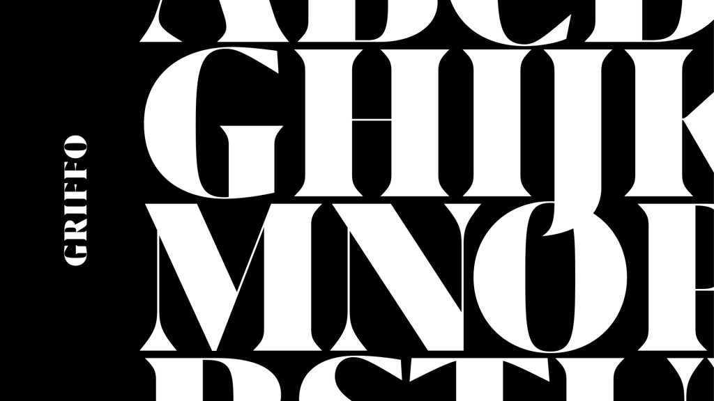
The backbone of our new suite of typefaces is Grifo, which was used to create our new logo as well. We selected Grifo for its versatility–depending on the weight and width of a chosen piece of text, Grifo can look elegant, bold, or even downright radical. Its name derives from the Portugese word for Griffin, the mythological half-lion, half-eagle creature with sharp talons–thus the sharp serifs of the typeface. Heavy metal, for sure.
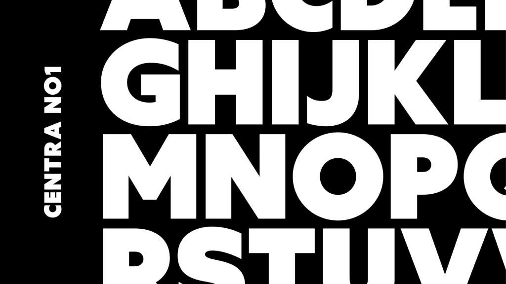
Our sans serif font is Centra, which derives its humanist design from the classic typeface, Gill Sans. It follows the rigid Bauhaus approach to geometric type, yet bends the rules when necessary in favor of legibility. The result is a very readable typeface, accessible by all.
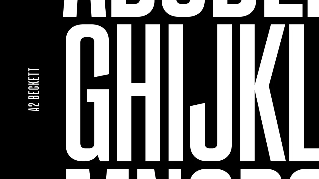
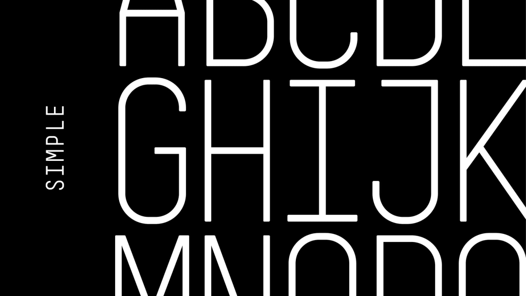
We have two other typefaces in the supporting role: our condensed font, A2 Beckett, and our monospaced font, Simple. Think of the previous two typefaces as our salt and pepper, and these two as the spices.
Images galore
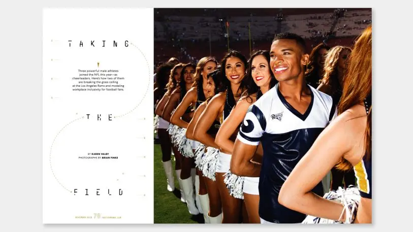
With our new design, we have a stronger commitment to visual narratives. To be inclusive of all types of audiences, we’ve embraced a mix of both written and visual storytelling. You’ll see a wider variety of portraiture and environmental photography–inviting readers into the minds and work spaces of the people we cover.
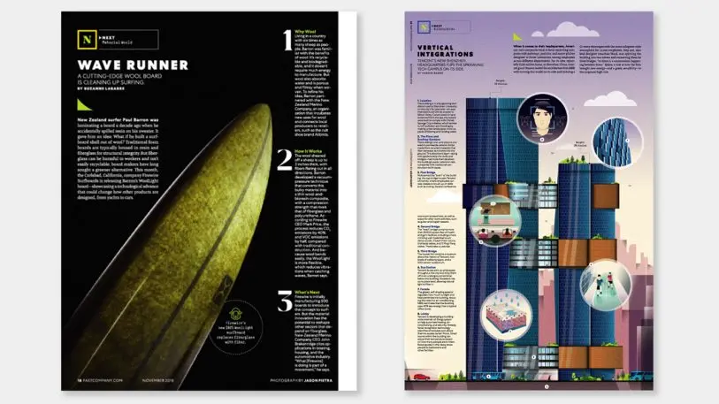
But just as the companies that Fast Company covers are never complete in their mission to innovate, neither are we. I’m excited for this new step in Fast Company‘s legacy, but even more excited for what’s to come.
Recognize your brand’s excellence by applying to this year’s Brands That Matter Awards before the early-rate deadline, May 3.
