


With the rise of soft, cloth-coated gadgets, it’s become clear that fashion and interior design are impacting consumer electronics. But influence is a two-way street–and the design language of Silicon Valley is also influencing other design sectors. Take Pantone, which is introducing a new slew of colors, called Metallic Shimmers, for a world obsessed shine and shimmer–and where most of us drop $800 on a new phone every two years.
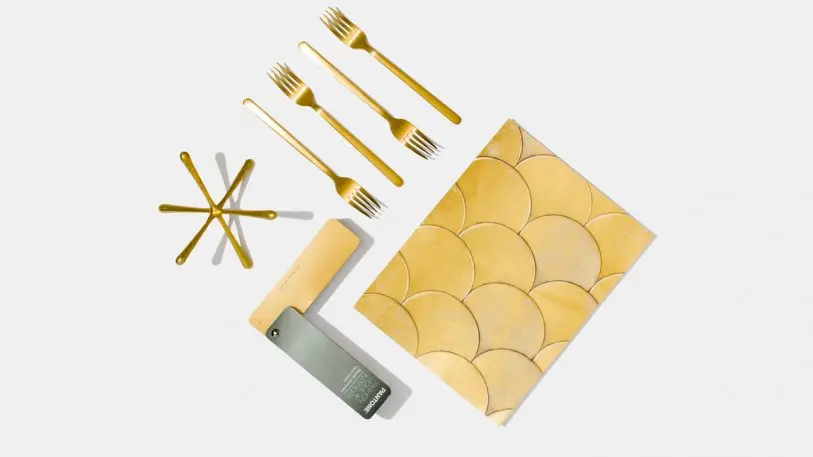
Consisting of 200 colors–ranging from more traditional silvers and golds, to more aggressive purple sequin or blue diode–it’s meant as a reference point for anyone developing products today.
Since 1956, Pantone has been a color standardizer–the provider of a unified color language that underpins the things we buy, wear, and make. More recently, Pantone has matured into a business built upon identifying and forecasting trends, too.
“Years back, fashion was your key driver. But there are so many more things influencing color direction now,” says Laurie Pressman, VP at the Pantone Color Institute. “I do look at consumer electronics as an influencer, because you see people start to look at electronics almost as accessories.”
Whether it’s a rose gold iPhone in your hand, a pair of cherry-red Beats on your ears, or something like the matte-black Echo in your home, Pantone has watched the metallic finishes of our gadgets impact the design world at large. “It has become normalized,” says Pressman. Five years ago, the company began developing its own color line focused around metal.
Pantone’s new line serves two markets. First, it’s a tool for the consumer electronics industry itself. Pantone has actually consulted for both LG and Huawei over the past few years, as the technological giants have both released colorful hardware of their own. Coloring metal is an extremely finicky process compared to an ideal substance like cotton, and it can involve all sorts of industrial methods from etching to anodizing.
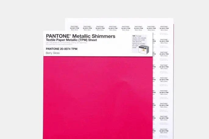
Pantone recognizes that perfect metal-based color matching needs to happen with suppliers off the assembly line, but believes its metallic swatches (which are technically pigment applied to paper) can be an anchor in the design process all the same.
“It becomes a visual reference. When they go into production, they may have to make some changes,” says Pressman. “But if they have a place to start, rather than saying, ‘Picture this,’ because it’s really hard to picture this!” And as Pressman points out, getting a color wrong in electronics can be even more expensive than fashion–you don’t want to put $1,000 of microprocessors in the clearance bin just because of the hue, as you might a polyester T-shirt.
The other even larger market that Pantone believes will take advantage of these new metallics? Every other company that makes consumer goods across the board right now. From interior furnishings and fashion to cosmetics and nail polish, shimmer is omnipresent in basically everything. “Metallics are now just a given,” Pressman says. “They’re just a thing.”
Recognize your brand’s excellence by applying to this year’s Brands That Matter Awards before the early-rate deadline, May 3.
