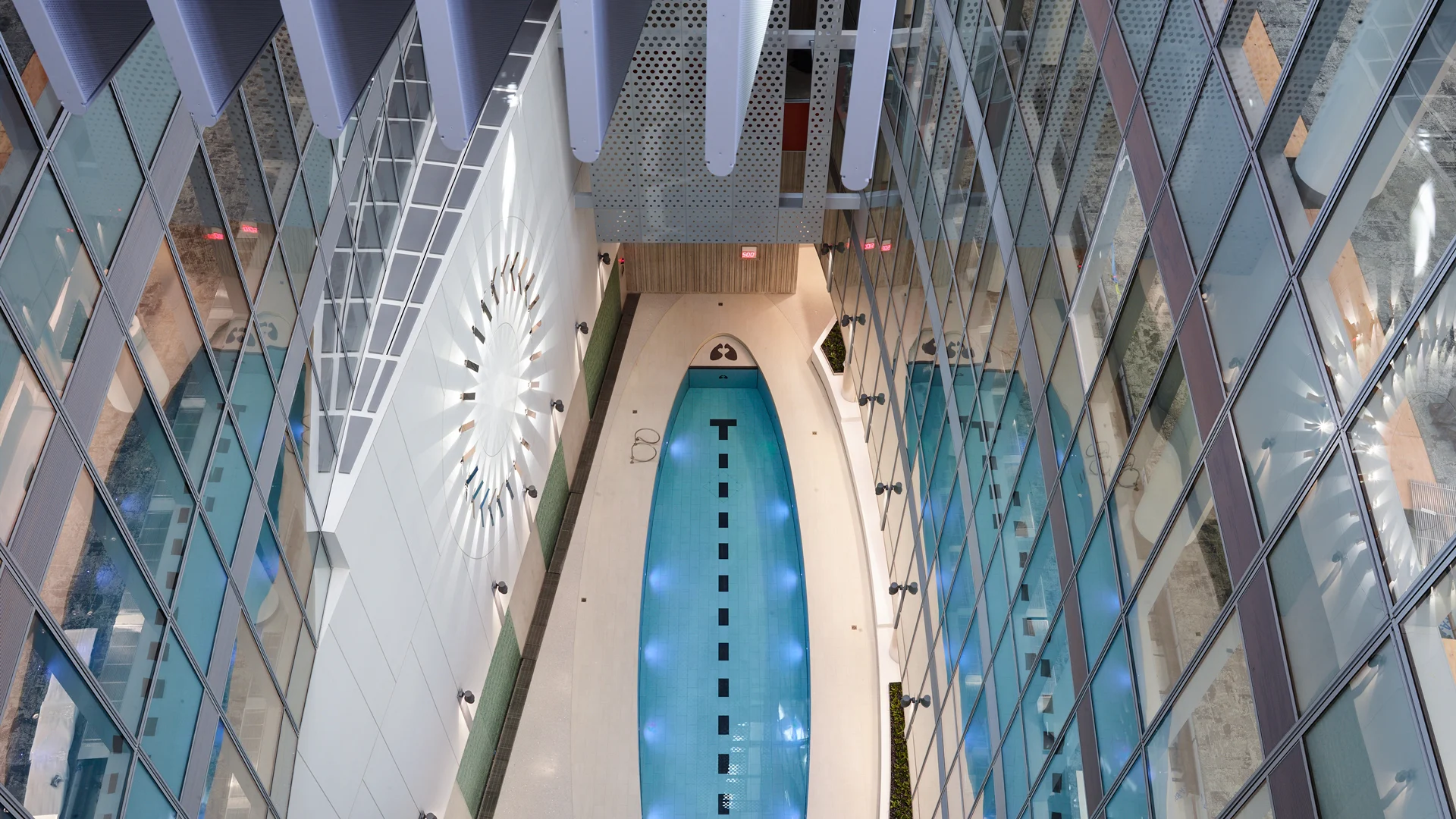


When you’re standing just outside the doors to the Maryland-based biotech company United Therapeutics’s new headquarters, there’s nothing in particular that indicates that you’re about to enter one of the few “site net-zero” buildings on the East Cost–meaning that it uses only the energy it generates within its footprint.
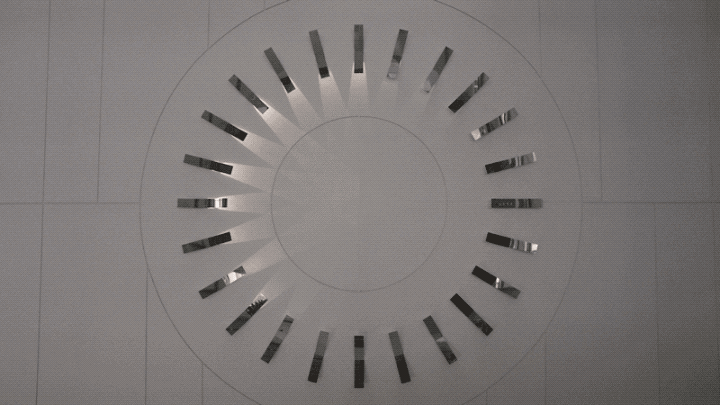
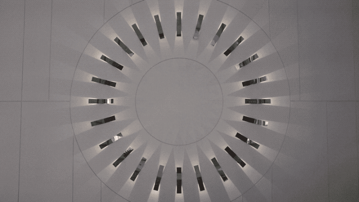
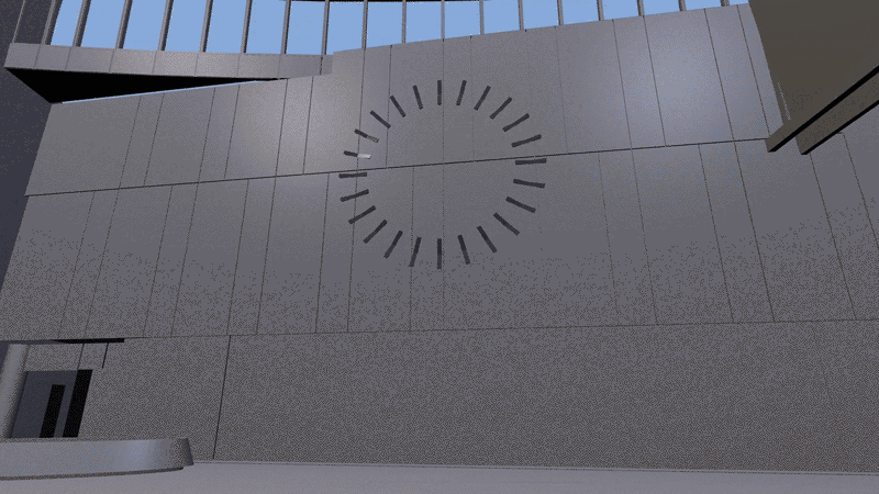
But then you walk in the front doors. On the wall of the building’s large atrium is an installation that looks like a giant sundial, with 24 silver markers arranged in a giant circle and connected only by beams of light. When the lights point to the center, creating a beautiful geometric pattern on the wall, they’re indicating that the building is using energy. When they reverse direction, they’re visualizing that the building has started to generate solar energy.
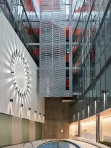
The Energy Dial, as it’s called, was designed by the experience design firm Hush, with the goal of helping the people who work in Unither’s new building understand their own role in its sustainability. It’s a building-size interface that’s designed to do something many architects struggle with: communicate how individual behavior impacts the overall energy footprint of a building.
“We needed to create a bunch of experiences inside that basically create empathy from people to the technology that’s working in the background,” says David Schwarz, a partner at Hush. “That helps people to understand, it’s a hot summer day, so I’m not going to turn up the thermostat.”
The installation goes further than most data visualizations that attempt to explain the flow of energy in a building. By simplifying the hundreds of thousands of data points that the building generates every day as a simple binary–if it’s creating energy, or it’s using it–the designers aim to effectively communicate with the people who work there and ideally impact their behavior. “In order to participate in something, you need to be informed: Why am I doing this?” Schwarz says. “Not, let’s just show you the building’s data today.”
The large, airy atrium was the ideal place to put the Energy Dial, because all six floors of the building have glass facades facing it. But because it’s so highly visible, Schwarz and his team were mindful not to just use a big screen. “It’s not the environment where you put a big billboard with a bunch of numbers and facts and figures,” Schwarz says. “We needed to design something that spoke to people in a very gentle way and was iconic and could just be the little reminder of their relationship to the building.”
[Image: courtesy Hush]
Hush also designed some other more technical visualizations for those who do want to nerd out on the data. These visualizations, which take up a wall within the headquarters, map out the past, current, and future predictive models of the building’s energy use based on sensors, seasonal data, and information from the system itself. These were designed so that the Unither team can exhibit the building’s sustainable infrastructure to visitors.
Of course, because the building is so conscious of its energy, all the installations had an energy budget as well–the first one the Hush team had ever worked with. This guided the final design for the Energy Dial, which uses low-wattage lights to communicate energy status. “Every move we made had to be analyzed not just from aesthetic point of view or a user standpoint but also from the energy expense,” says Schwarz. “Is this going to undermine the whole point of the building? Are people going to say: Why did they do this, they’re wasting electricity, but they’re asking me to save electricity?”
It’s a very different project constraint for the design firm, which focuses on digital experiences. As a result, the project required a specific kind of minimalism. “This was really the first time we had to consider it literally on a spreadsheet to see what our interventions were costing from an energy standpoint,” Schwarz says. “It’s not just about conceptually keeping it simple.”
As the energy use associated with information and communications technology continues to rise–contributing as much as 3.5% to global emissions by 2025–it’s a new constraint for designers and technologists. After all, the Energy Dial shows you don’t need high tech to do good design.
Recognize your brand’s excellence by applying to this year’s Brands That Matter Awards before the early-rate deadline, May 3.
