If you’ve spent any significant time looking at data visualizations–or in a STEM classroom–you’ve probably had this maxim drilled into your head: Correlation does not imply causation. In plain English, it means “just because A and B appear to be related doesn’t mean that A caused B to happen.” Statisticians and chart nerds love to point out this fallacy by setting up patently absurd correlations, like matching up the divorce rate in Maine with per capita consumption of margarine. Nobody would seriously believe that eating margarine causes divorce. But what about subtler correlations like this one?
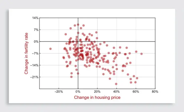
If, after scanning that graph, you can’t help but think that higher housing prices are somehow causing women to have fewer babies… well, you wouldn’t be alone. Carl Bergstrom and Jevin West, two researchers at the University of Washington, think that the very layout of the graph itself–one set of numbers laid out horizontally, another set arranged vertically–may be partly to blame.
That classic “X vs Y axis” graph, known as a scatterplot, is a workhorse visualization in science and statistics. Researchers use it to explore how closely two sets of measurements are related to each other. Scatterplots make this exploration easier, because the correlations literally line up as visual patterns right in front of your eyes.
The trouble, says Bergstrom, is that these “correlation-only” scatterplots follow exactly the same visual conventions as graphs that are explicitly intended to show causation. Which graphs? According to Bergstrom, pretty much every one you saw in high school. Whether we were fussing with f(x)’s in geometry class or filling out lab reports in chemistry, for those of us whose visual-statistical education ended shortly after senior prom, the entire idea of plotting data on an X-Y grid means “this thing causes that thing.”
But Bergstrom and West don’t want to rebuild graphing from the ground up: “We are stuck with with the norms we already have,” they write. Their solution? Keep the same Cartesian grid system we all learned on in high school, but display it at a 45-degree angle to create what they call a “diamond plot.” Here’s that graph about home prices and fertility again, redisplayed according to Bergstrom and Wise’s scheme:
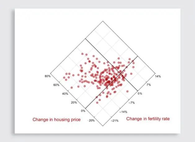
The correlations themselves still form clear visual patterns on the grid, just like the did in old-fashioned scatterplots. But with both sets of numbers tilted at symmetrical angles, neither axis appears to take causal priority over the other. In other words, the layout of the graph doesn’t nudge you to project nonexistent storylines onto the data.
That’s the hunch, anyway. Bergstrom and West freely admit that they still need to validate diamond plots with rigorous user testing. Alberto Cairo, information designer and author of The Functional Art, thinks that “the diamond [plot] is an intriguing idea.” But he also thinks that the problem lies less with graph design and more in our own built-in cognitive bias to see causation in everything. “We evolved to detect patterns, even if patterns are just the product of random clustering, and come up with stories to explain them,” he says. “How to overcome these biases? A conscious effort, informed by education, to curb our impulse to jump to conclusions.”
Bergstrom agrees that our natural pattern-recognition habits are a major factor in misinterpreting scatterplots; he just doesn’t think it’s the only factor. He and Wise are planning to test diamond plots this autumn. But Bergstrom also understands that putting standard graphs at a Dutch angle might cause more problems than it solves, by making the visualizations more difficult to read. “If it turns out that diamond plots are effective at reducing unwarranted causal inferences without imposing too great a cognitive cost [on users], of course we will be using them going forward,” he says. “If not, well, that is the nature of science: You propose an idea, test it, and discard it if the evidence stacks up to the contrary.”
Recognize your brand’s excellence by applying to this year’s Brands That Matter Awards before the early-rate deadline, May 3.
