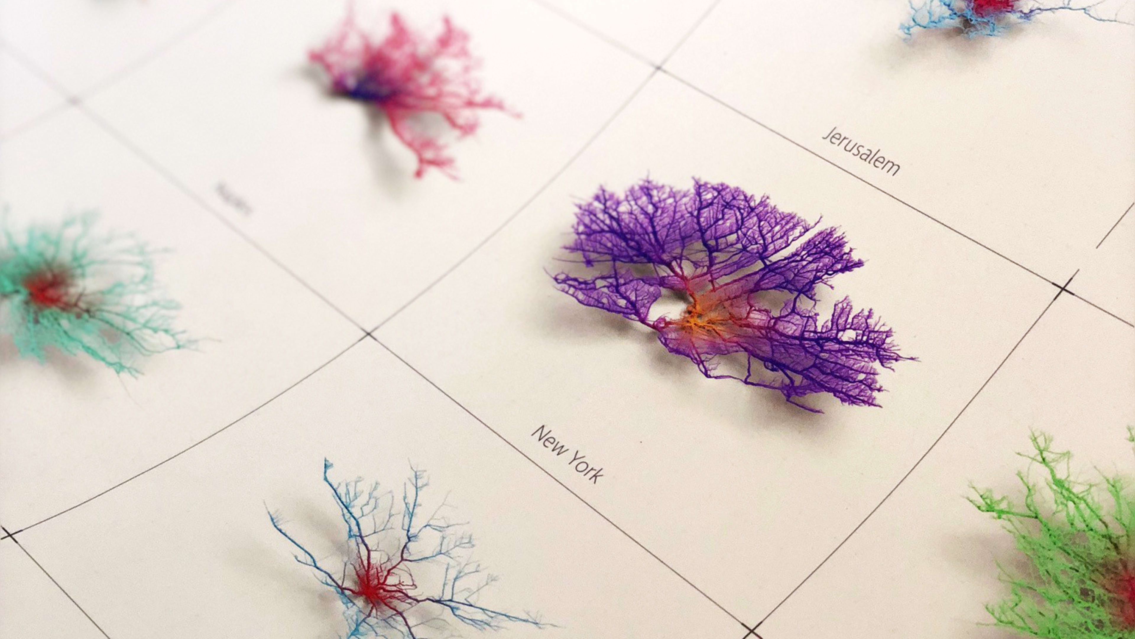
When most of us picture our commute into work, we see the back of another car, or perhaps recall the sordid scents of the subway. But when Craig Taylor, Data Visualization Design Manager at Ito World, pictures a commute, he sees something vastly different. He sees ocean corals in all colors of the rainbow.
[Image: courtesy Craig Taylor]
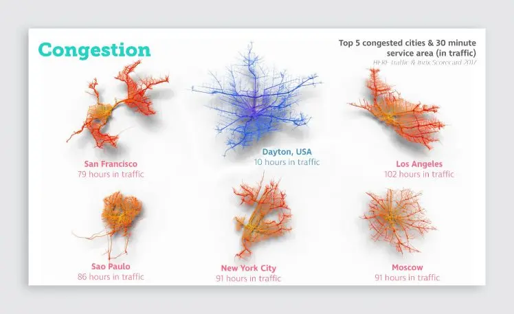
His project, Coral Cities, maps out how far you can travel by car from the city center in just 30 minutes, ignoring traffic. In a beautiful series of animated visualizations, Taylor renders the complex network of streets in 40 cities across the globe as if they were living, breathing coral–a far more lovely depiction than infrastructure normally receives.
It’s half art, half science. The webs represent the major arteries in each city, and they’re shaped largely in response to geographical features, like water and mountains. That’s why Paris’s roads bloom outward like an unfettered blossom, while Barcelona is lopsided, stunted against the sea. The rainbow hues you see don’t mean anything at all–the colors are purely aesthetic, playing up the diversity and complexity of the grids.
“It’s also fascinating how the density of networks varies from one city to another,” Taylor points out. “Some are more grid-like, such as New York City and Beijing, while some exhibit a more random pattern.”

Recognize your brand’s excellence by applying to this year’s Brands That Matter Awards before the early-rate deadline, May 3.
