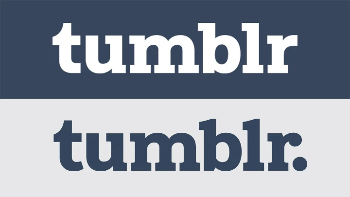
Tumblr (remember Tumblr?) is the latest company to simplify and straighten out its logo. The microblogging site, which has struggled to avoid becoming another MySpace or Second Life as it has bled users in recent years, is introducing a new wordmark, dropping the period at the end of the logo and hammering out the curved angles of its serifs.
The period was a fundamental part of the company’s brand, a nod to the spoken phrase “Tumblr dot com.” In recent years, the company had experimented with turning it into an opportunity for ad sponsorship; Starbucks paid to turn the dot into a coffee cup for a day back in 2014.
The changes were executed by the Swiss design firm Dinamo, which worked in collaboration with Tumblr’s Creative Director Doug Richard as Brand New reported this week. The project started back in 2016, when Richard contacted the firm to explore the possibility of a custom typeface (an aspect of mobile branding that plenty of other tech companies are investing in). After developing a typeface called “Favorit” for the platform, Dinamo moved on to the logo.
Some aspects of the logo were tweaked to better fit the new typeface. “The ‘t’ and ‘r’ characters were recut to stylistically align with defining attributes of the custom typeface,” the designers write on their website. They also replaced curved intersections to optimize the logo for small screens. “Other letters received more subtle updates,” they continue, “cleaning up overly nuanced attributes, and bringing a more architectural feel to the mark.”
The most notable change, though? Killing the dot. “[W]e strategically removed the logo’s period, allowing the logo and typeface to seamlessly integrate across all naming conventions,” they add.
Sure! But dropping the weird dot and cleaning up the lines falls in line with another trend racing through the tech world: The increasing sameness of logos. From Airbnb to GoDaddy to Google, we’ve seen companies simplifying and sans-serif-ing their once-quirky logos in recent years–killing off the quirkiness that made them unique in their early years as young startups.
In the end, Tumblr is facing bigger challenges–like the loss of users that began in 2013 after its acquisition by Yahoo derailed it, and continues as its popularity is undermined by other platforms like Instagram, Snapchat, Giphy, Imgur, Medium, and even good old Reddit.
The new logo, which is officially available on Tumblr’s site, was implemented this summer. Rest in peace, little dot.
Recognize your brand’s excellence by applying to this year’s Brands That Matter Awards before the early-rate deadline, May 3.
