Five years ago, Slack was an unknown business collaboration upstart available only in a private beta test. Already, though, cofounder/CEO Stewart Butterfield was pitching the messaging service as a powerful collective memory for the businesses that would adopt it. He waxed eloquent about “the entire corpus of organizational knowledge” contained in conversations among coworkers and declared Slack to be “built around search.”
Fast forward to today. Slack has 8 million daily active users, making it one of the fastest-growing workplace tools of all time. Over its half-decade of ever-expanding influence, it’s indexed more than 100 billion messages and other interactions, and is adding billions more each month. For many organizations, the information that employees have been sharing in Slack is indeed chock-full of nuggets with lasting value.
All of which makes it particularly odd that its search features have felt so stunted for so long.
It’s true that anyone with the patience to study up on syntax and filters could construct a query to retrieve anything stored in the service. But if you just typed in keywords—like the name of a colleague and a term or two relating to a discussion you had with her a few weeks earlier—the information you sought might or might not rise to the top of the search results you got.

Now Slack is giving its desktop and web-based incarnations the biggest changes it’s ever made to their search functionality. Instead of treating sophisticated features like the sort of thing only advanced users would care about, it’s exposing them with a new visual interface, which provides all of the power without the learning curve. It all comes back to the idea that Slack can help colleagues share what matters—not just in the moment but over the arc of time.
“Every person that leaves the company, a lot of information and context goes with them,” says Underwood. “Each person that joins the company has to kind of rub sticks together and make fire all over from scratch again. People don’t typically get work done within companies; teams get work done. So that context, that history, all those workflows, the decisions, everything that has happened should be stable, no matter who’s coming in and out of a team.” The goal of Slack’s new and improved search is to ensure that it’s not just stable, but discoverable.

Move slowly and refine things
Unlike some tech companies, Slack has never believed in pushing out code as quickly as possible and then smoothing out rough spots after the fact. Instead, it makes a good-faith effort to get new features right in the first place, based on multiple rounds of prototyping, user research, and testing. Work on the new search functionality began over a year ago, says group product manager Jaime DeLanghe, who joined the company last December to spearhead the effort after seven years at Etsy. When she arrived, “there were a lot of ideas and the team had sort of settled on a direction, but a lot of the refinements and actually the bulk of the process hadn’t begun yet.”
Along with the design work needed to make search less opaque, Slack decided to invest in some long-needed plumbing upgrades. The service’s approach to managing the full-text indices that power search had not kept pace with user growth, especially as its customer base came to include enormous organizations with vast message backlogs to sift through. In February, the company rolled out new technology for managing the 100 terabytes of full-text indices which power search, built with both performance and flexibility in mind.

“We have everything from the beginning of time up to the time the index is created,” explains engineering manager Rocio Delgado. “And then for each day we have a live index. And that allows us to scale every single customer evenly.” The upshot: a 75% speed improvement, plus the ability to more easily support changes such as the revised interface.
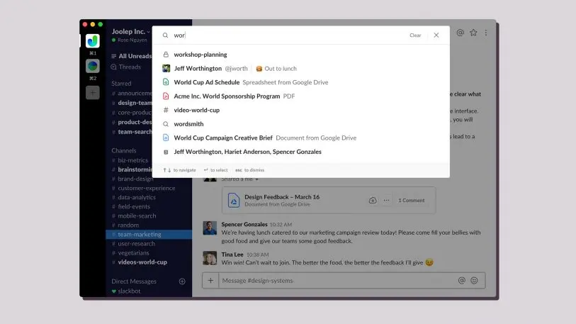
Zeroing in on that new interface presented Slack with a different set of challenges and, perhaps, tougher decisions. Until now, typing into Slack’s search field resulted in a tiny pop-up window with autocomplete suggestions. Starting in January, the company began rolling out a series of improvements to those suggestions–ordering them better by relevance, for instance, and adding links to files stored in the service. Research showed that many people perform the same searches over and over, so Slack added recent searches to the autocomplete list, letting you perform them again with one click.
Historically, Slack’s search results have shown up in a narrow column on the right-hand side of the screen, thereby leaving the messages in the center column untouched: “We’ve always been really cautious to introduce anything that would interfere at all with the messaging experience,” explains Underwood. (That thinking also helps explain why threaded conversations open up in that right-hand column—known within Slack as the “flex pane”—when you click them.)
As Slack’s designers began to play with possible designs for more inviting search tools, however, they quickly concluded that a better experience would demand more elbow room. “We just found that the space allotted wasn’t allowing us to do the deep kind of investment that we wanted to do to be able to build the search features that we think are really critical for the kinds of Slack instances that exist today,” says DeLanghe.
Ultimately, the company summoned enough courage to depart from its don’t-mess-with-the-middle-column philosophy. With the new upgrade, “we think we’ve found a design approach that actually gives you the best of both worlds: more powerful search, and easy access to jump straight back into what you were doing,” Underwood says.
[Image: courtesy Slack]
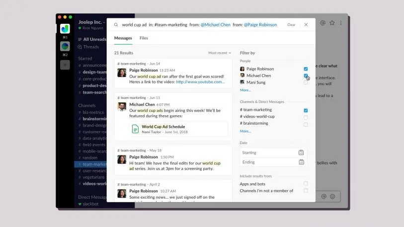
Clicking on the search field now brings up a larger window spanning most of the width of the entire interface. As you type, autocomplete results pop into place and the window expands to accommodate them. And when you’re done entering a search query and the results appear, you get a dashboard which overlays that sacred middle column as well as the left- and right-hand panes, temporarily obscuring them.
The search results are on the left side of the dashboard, with your keywords highlighted within snippets of text. In itself, that format isn’t a radical departure from its predecessor, but the mere fact that this list is no longer crammed into the skinny flex pane makes it easier to skim. The dashboard’s right-hand side, however, plays the biggest role in making searching Slack less of a black art. It’s dedicated to a series of filters which let you winnow the results by pointing and clicking. For instance, you can restrict results to messages from one or more specific coworkers. Or ones from only certain channels. Or ones posted between two dates. Or any combination thereof.
Additional filters let you choose whether or not to see results from bots as well as humans and from channels of which you’re not a member. If you’re searching for a file, you can also specify the file types you care about, such as Excel spreadsheets or PDFs.
Command-line nerds can still compose their own queries using Slack’s existing search syntax to get exactly the same results that less geeky types can pull up with the new interface. It’s just that the dashboard makes every option immediately obvious, whether it’s the first time you’ve used it or the 500th. As Underwood puts it, “the way that we’re thinking about the products that we’re building is increasingly setting that bar as, ‘How can we make this feel as easy to use as the software you use in your other walks of life?'”
DeLanghe adds that Slack hopes its biggest customers will find the new search features especially transformative. “As you move from a 50-person team to being a member on an enterprise grid with tens of thousands of users, your channel list gets really huge, your people list gets really huge, and you need a really fast way to navigate,” she says. “We wanted to create a centralized place for users to just be able to get to where they need to go quickly.”

The shape of Slack to come
For all the ways in which Slack’s new search features should be welcome the moment people try them, DeLanghe is quick to describe them as “a first step toward a deeper investment. This is a foundational move, in a lot of ways.”
At the same time that Slack is building that search foundation, it’s engaged in equally serious work on the way its service integrates with other major business tools. Even early on, the company positioned itself as a hub for work of all sorts, a vision which has already become reality: Its App Directory contains more than 1,500 apps that can be used inside the service. Users have installed it more than 8.8 million times.
Just as power searching has required a willingness to learn how to construct queries, making full use of integrations has sometimes involved familiarizing yourself with arcana such as slash commands. In May, however, Slack introduced actions, which let you create stuff in other services—an Asana task, a Zendesk ticket, a Polly poll, and more—simply by choosing an item from a menu within Slack. Spiritually, actions are the integration equivalents of the new point-and-click search features.
The more that such activities happen within Slack, the more an organization’s Slack history becomes a definitive record of the collaboration that goes into its work, and the more valuable the ability to search it becomes. “Before Slack, you would have to go look in five different places even to find a file,” says Underwood. “Was it a PDF? Was it a file in the cloud? If so, which service was it on? Slack serves as the common denominator that allows you to search across all of them.”
Realizing the full potential of this unified-search vision will involve further work, such as Slack helping third-party developers to expose their data as fully as possible to its indexing engine. As usual, the company wants to nail such tweaks rather than rush them out. And if customers agree that much of the service’s value comes from gradually filling it with knowledge, Slack will have the time it needs to build out additional functionality. Underwood is certainly thinking about the long haul: “It’s pretty wild,” she says, “to think about what this will look like when we are five, 10, 20 years into it.”
Recognize your brand’s excellence by applying to this year’s Brands That Matter Awards before the early-rate deadline, May 3.