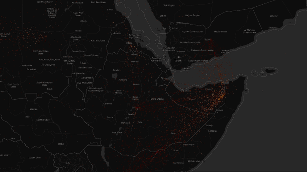
In 2016, more refugees arrived in Uganda–including nearly half a million people from South Sudan alone–than crossed the Mediterranean Sea to Europe. While the numbers in Africa are increasing, the situation isn’t new: As the world continues to focus on the European refugee crisis, an equally large crisis has been unfolding in Africa.
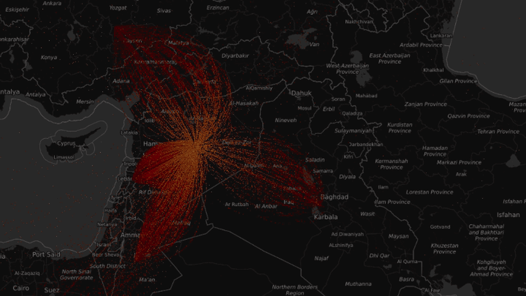
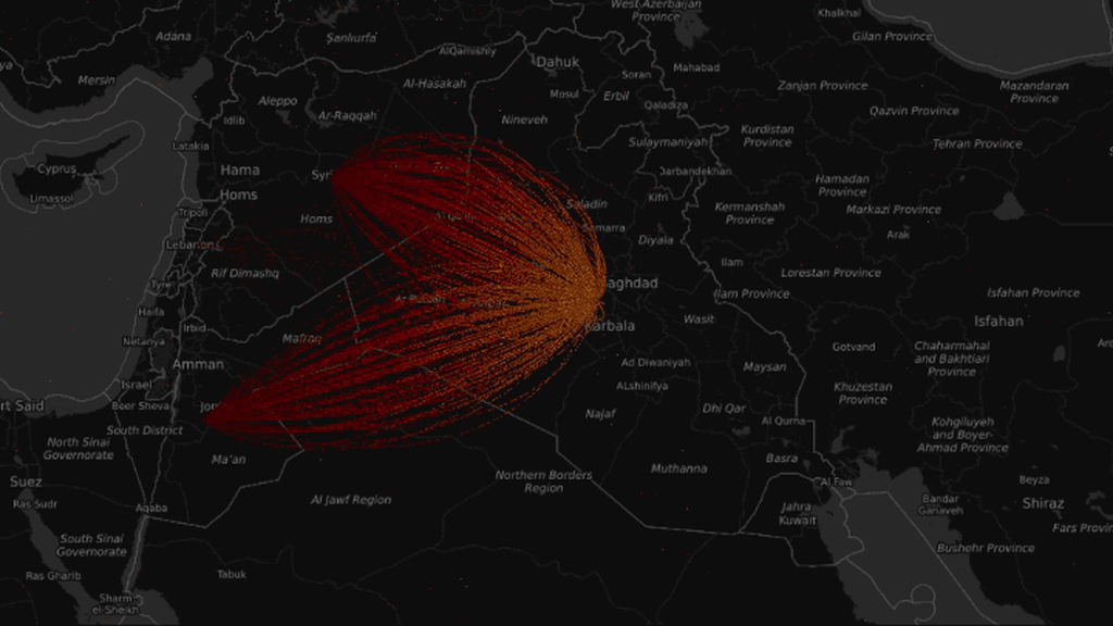
A new visualization shows the flow of refugees around the world from 2000 to 2015, and makes the lesser-known story in Africa–and in places like Sri Lanka in 2006 or Colombia in 2007–as obvious as what has been happening more recently in Syria. Each yellow dot represents 17 refugees leaving a country, and each red dot represents refugees arriving somewhere else. (The full version of the map, too large to display here, represents every single refugee in the world with a dot.)
Here’s some of what you’re seeing: In 2001, tens of thousands of refugees fled conflict in Afghanistan, while others fled civil war in Sudan (including the “Lost Boys,” orphans who in some cases were resettled in the U.S.). By 2003, the genocide in Darfur pushed even more people from Sudan. In 2006, war drove Lebanese citizens to Syria; Sri Lankans fleeing civil war went to India. In 2007, as conflict worsened in Colombia, refugees fled to nearby countries such as Venezuela. After leading demonstrations in Burma against dictatorial rule, Buddhist monks and others fled to Thailand. In 2008, a surge of Tibetan refugees fled to India, while Afghan, Iraqi, and Somali refugees continued to leave their home countries in large numbers. By 2009, Germany was taking in large numbers of refugees from countries such as Iraq. In 2010, another surge of refugees left Burma, while others left Cuba. By 2012, the civil war in Syria pushed huge numbers of refugees into countries such as Jordan. Ukrainian refugees began to flee unrest in 2013, and in greater numbers by 2014.
By 2015, the greatest number of refugees were coming from Syria, though mass movement from African countries such as South Sudan also continued–and because most of those refugees went to neighboring countries rather than Europe, the migration received less media attention. In 2015, the U.S. resettled 69,933 refugees; Uganda, with a population roughly eight times smaller, took in more than 100,000 people. Developing countries host nearly 90% of the world’s refugees.
“Often the debates we have in society start with emotion and extreme thoughts, like, ‘Oh, refugees are invading the U.S.,'” says Illah Nourbakhsh, director of the Community Robotics, Education, and Technology Empowerment (CREATE) Lab at Carnegie Mellon University, the lab that developed the technology used create the new visualization. “You can’t get past that–you can’t build common ground for people to actually talk about real issues and how to solve them.”
Showing people data in an animated, interactive visualization, he says, is “an interesting shortcut into your brain, where the visual evidence is more rhetorically compelling than any graph or chart that I show you. That visual evidence often moves you from somebody who’s questioning the data to somebody who can see the data. And now they want to talk about what to do about it.”
The lab began working on its Explorables project, a platform designed to help make sense of big data, four years ago. To make big data–with billions of data points, dozens of different fields of information, changing over time–easier to explore, the platform layers animations over maps.
The team has also used systems like Google Earth to explore big data, but even it can only display a few hundred markers, and it requires installation on computers. The researchers realized that they could use a graphics processor in someone’s computer directly, in the same way that a video game does. “What’s kind of cool is that the video game revolution has changed the computer’s architecture over the last decade,” he says. “So the computers have this amazing ability to very quickly render on the screen.” That technology is combined with an ability to display only the resolution needed for the data you’re zoomed in on, making it possible to share massive amounts of data.
You can watch a video of the refugee flow below:
The researchers have used the platform to display data about inequality, carbon dioxide emissions, and the bleaching of coral reefs. Working with the Brazil-based think tank Igarape Institute, they helped incorporate the institute’s data on the fragility of cities, from unemployment and pollution to the risk of violence.
The flow of refugees was one of the stories they wanted to tell, both in the case of Syria and the rest of the world. “The prevailing notion that all these Syrians are going to Europe is nonsense because as you zoom out you realize they’re going to three neighboring countries around Syria the most,” he says. “There’s a little flow to Europe. Then to really blow people away, we pan south, and suddenly you see these massive plumes of Central African refugees moving from country to country that are completely bigger than the Syrian refugee flows. And here’s the untold story.”
In Uganda, where as many as 4,500 people arrived from South Sudan each day in the last week of January 2017, the country has had a longstanding policy of welcoming refugees with free land and the right to work and start businesses. But it is beginning to strain under the pressure of an unending flow of new arrivals.
“The trouble with most of these situations is they’re just so desperately underfunded, even if there is cooperation from the host governments,” says Kathleen Newland, cofounder and senior fellow at the Migration Policy Institute. The UN’s refugee agency, UNHCR, has only received a small fraction of the funding it needs for 2017. “That will go up because countries deliver their pledges in dribs and drabs, but there’s just a tremendous amount of concern that they just don’t have the capacity to even do the basics for people, and that’s really a recipe for instability and misery,” she says.
The visualization could help people better understand the extent of the issue, and potentially push for support. “Let’s put this in perspective,” Nourbakhsh says. “There are a lot of refugees coming out of Syria. But check out Central Africa: We aren’t even paying attention to these. It changes people’s perspective, and it makes people care more.”
Recognize your brand’s excellence by applying to this year’s Brands That Matter Awards before the early-rate deadline, May 3.
