Social media’s move down Main Street, with 821 million people using Facebook each month, has changed the face of consumer software forever. Fears that our parents, retailers, and older colleagues will live in the analog world forever finally seems like last year’s news. Hallelujah.
Yet most enterprise software vendors and the IT departments procuring their wares haven’t caught up. They haven’t caught on that people gravitate toward tools where they can make connections–with ideas, insights, and people. We return to tools that don’t make us feel stupid. We stick with tools that are friendly, focused, functional, fun, and fast. Shouldn’t business tools share those aspirations?
A recent study by AIIM and N:Sight showed that greater than 47% of employees 18-30 and 37% of those 31-45 expect to use the same type of networking tools with their business colleagues as they do with friends and family. Don’t you?
As Chris Locke said more than a decade ago in the Cluetrain Manifesto, [in the past] “only corporations could provide the kind of resources needed to process even modest volumes of information. Today people have that kind of power in their rec rooms. If the company doesn’t come through with the kind of information and delivery that turns them on–provides learning, advances careers, and nurtures the unbridled joy of creation–well, hey, they’ll just do it elsewhere. Maybe in their garage.” With smartphones and tablet technology, our rec room can now be the rest room or a coffee shop as easily as a cube or meeting room, bypassing corporate firewalls.
Bad design has more than morale and productivity consequences. Hick’s Law states that the time it takes to make a decision increases as the number of alternatives increase. Most enterprise software prioritizes advanced capabilities over usability, let alone making well-informed decisions. As systems get more flexible (the holy grail of many designers), usability usually decreases.
When launching Peoplesoft’s usability organization in 1998, we sought more than creating a wizbang interface. We aimed for productivity strides from every customer. I’d convinced our CFO that our education organization’s prime profit could be far surpassed if the software didn’t require so much training. With help from Judee Humberg, who had headed usability at Intuit, we set out to understand what people wanted to do. We then worked to create an attractive software experience that supported people’s goals.
Does this seem like too much to ask of your vendors? Have you grown accustomed to archaic software, accepting that that’s the way it has to be? Pause. Take a deep breath. Look through some of these inspiring designs. Then plan an intervention for your tech buyers.
The workforce of the future has arrived.
Wide research on demographic shifts show that organizations and their tools need to work differently to attract, retain, and inspire talent. These shifts are caused by differences in generation, gender, economics, and consumer expectations.
Never before have four different generations, with four different sets of experiences, been in the workplace together. A young colleague, expecting instant answers and constant connectivity works beside a coworker ready to retire who doesn’t want to waste time navigating inefficient systems. Make it work or they walk…or worse yet, squander your money for hours every day.
Although there’s a perception older workers don’t widely embrace technology, a report from Kathryn Zickuhr at the Pew Trust showed the relative simplicity and convenience of cell phones means that 68% of adults in the oldest generation in the workforce use them. More surprising? Your older workers are almost as likely as anyone else to send text messages (though surely not as many as younger workers), which means even they are committed to better ways of getting things done.
We may not have entered the Jetson’s age (yet), but we’re close. Success will go to businesses savvy enough to understand, learn from, and leverage critical shifts.
Complexity is not the enemy of simplicity.
Daisy System alum Moshe Gray said to me recently, “No one has invented truly new software in decades. Everything is still just a thin veneer over a spreadsheet.” It seems that way. It looks that way, too.
Bill Kutik, in a recent Radio Show interview, asked me if those foolish requests for making software look as easy to use as Amazon.com had been replaced by appeals for Facebook-like interfaces. Yes, they have. For all the reasons Facebook is so popular.
Unfortunately, developers often dismiss these requests, arguing that the processes companies need automated are more complex than Amazon or Facebook. But is that true?
Amazon is mediating access to well over a billion items disbursed across over 25 million square feet of space, serving 137 million customers a week, each with unique credit cards, mailing addresses and e-book platforms. And their interface is still busier than it needs to be.
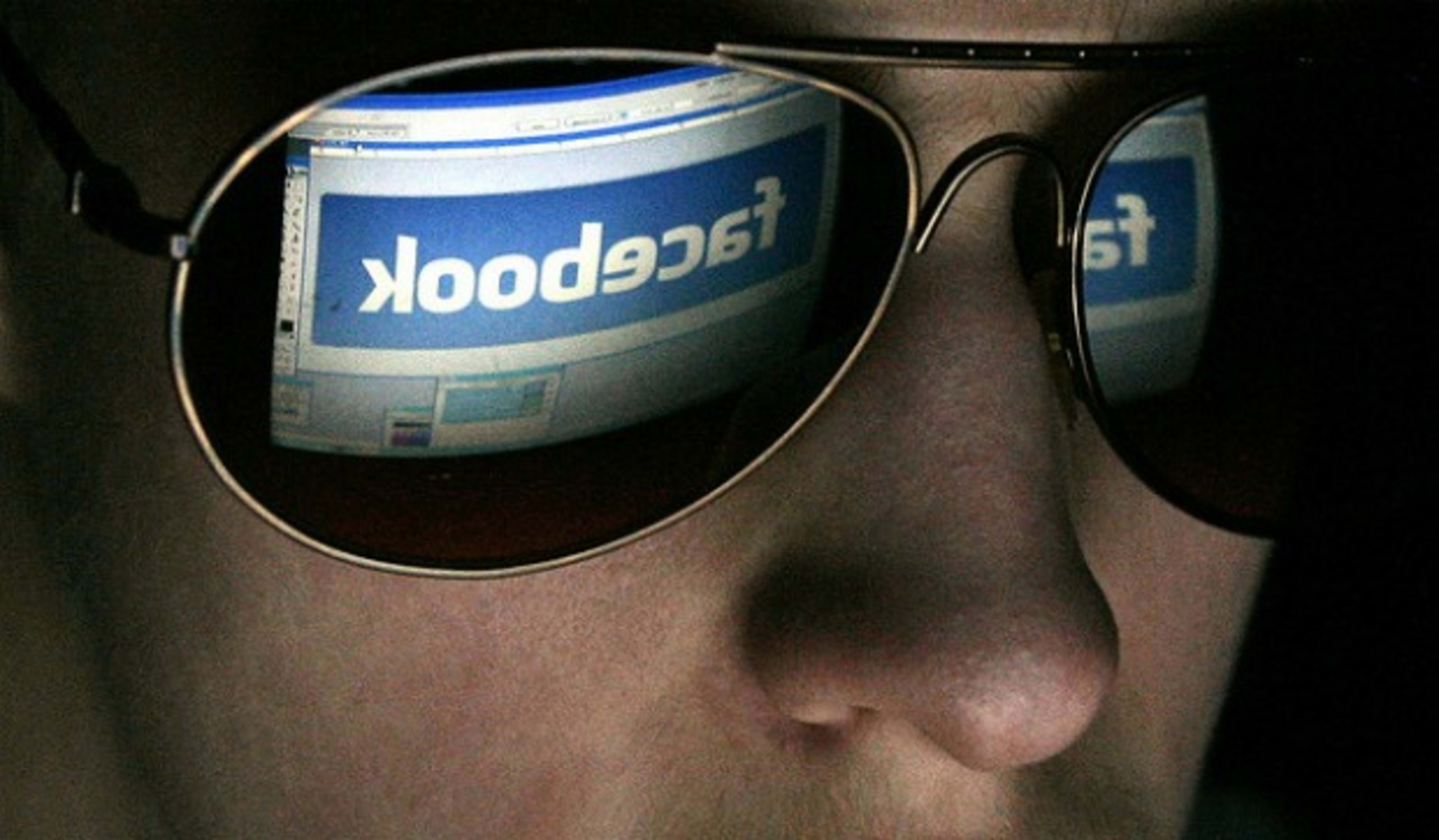
Facebook has more than 900 million objects that people interact with (page, groups, events, and community pages), available in 70 languages, and 250 million new photos uploaded each day, connecting people across groups and timelines. As archaic as Facebook may feel, especially when they roll out yet another new design, it expertly hides data being gathered and serves up the detail just in time.
Alan Perlis once wrote, “Simplicity does not precede complexity, but follows it.” In software design it can and it should. Well designed software doesn’t expect the people using it to understand the implementation model under the hood any more than Honda requires you to manipulate the engine in order to drive the car.
People don’t solve problems with features.
A good interface directs our attention to the purpose of the tool, rather than overwhelming us with all the things we could do but don’t need to. Apple’s streamlined interfaces have reset our expectations for how all applications, even data-heavy apps, can present information in clean, clear ways.
The edge capabilities of software need to be designed and programmed, but they should never be the design focus. Developers need to ask, “Will Phoebe want to perform this operation often? Will she ever?” With this knowledge, they should prioritize functionality. People have no patience for software that wastes their time.
“Reducing a product’s definition to a list of features and functions ignores the real opportunity–orchestrating technological capability to serve human needs and goals,” says Alan Cooper. “Too often the features of our products are a patchwork of nifty technological innovations structured around a marketing requirements document or organization of the development team with too little attention paid to the overall user experience.”
At the 2011 HR Tech Conference this point screamed out during the session focused on “Awesome New Technology for HR.” The first few vendors proudly demonstrated thoughtful applications. The audience oohed and ahhed at the potential they’ve wanted for years. Some of their interfaces, however, looked like clunky ERP systems of years past. Screen after screen of radio buttons and sorting list views give the impression the concepts may be awesome, but the time-to-market delivery cycle probably took way too long.
Then Aneel Bhusri showed Workday for iPad, which provides mobile access to Workday apps. In doing so, he did more than offer an alternative to leaders who have had to be deskbound to gain business intelligence about their workforce. He showed that people can gain insight into their workforce and make critical decisions about approving promotions, new headcount and time off, in a clear, people-friendly view. This wasn’t light location tracking or game-playing. It was a heavyweight data-intensive application presented in a useful, clean way.
Bhusri was followed by a demo from Keas, an online game that promotes employee wellness where people challenge one another to get healthier. The UI was clever, bright, and modern.

Cubevibe‘s Aaron Aycock also showed that a tricky process–real-time monitoring the sentiment of your workforce–need not be more awkward than talking with people about how they feel about their jobs.

With these demos, the energy in the room changed. People sat on the edge of their seats. The designs of these applications gave the impression that the tools weren’t built by geeks only for geeks. They seemed straightforward, and people-focused. They respected people’s time by keeping them focused on what needed to be done. They didn’t scream, “Get a better job!”
Featuritus costs more than money.
Most of us think about applications in terms of activities. Consider health care. You want this new year to be the healthiest ever, but you remember your doctor’s office’s crowded waiting room, your love of bacon’s sizzle, and the rub of a blister from your favorite running shoes. Meanwhile, technology providers think in terms of solutions–wanna buy a Fitbit? There’s a disconnect between what people want to do with technology and what technology vendors sell.
The cost of this disconnect is money, time, and organizational health.
Technology companies can create something modern, simply displaying the complex, and putting goals ahead of features. IBM put technology from Watson to work into software for clients like Seton Healthcare, aiming to lower readmission rates by putting powerful data in the hands of the real decision-makers, patients themselves. Using advanced analytics capabilities plus a rich and simple interface, they put critical information at the point of need.

These beautiful, simple, powerful tools also can nourish our whole selves.
No matter what work we do or our obligations for today, most of us share some simple personal goals. Workplace focused, they are personal accomplishments. For instance, most of us aim each year to advance in our careers, learn more about our fields, and set a good example for others.
Products designed to achieve business goals–at the peril of personal goals–fail. Our personal objectives must be met. When we submit a budget quickly, including perspective from all stakeholders, we have time to focus on the work in our midst. If a customer is delighted with the service you could offer, she’s more likely to help you make another sale. When you can make decisions about your own health, and that of your department or your whole organization, without frustration–or even with glee–your goals are more effectively achieved.
Just recently I was reminded by Judee Humburg that easy-to-use, enticing software stems from how natural and intuitive it flows with each click, how easy it is to learn, how well the functionality fits with the priority activities, its appeal, and how reliable it is when you’re doing the work. Our whole experience creates one perception that either encourages or thwarts our interest and success in using it again–and again.
Start now. Pressure your vendors to do better. Don’t settle. Run simple usability testing with eight new hires. If you must, have a transition plan.
Be courageous and doggedly determined to create a healthy year.
[Image: Flickr user escapedtowisconsin]
Recognize your brand’s excellence by applying to this year’s Brands That Matter Awards before the early-rate deadline, May 3.
